Tel / WhatsApp: +852-70974333 E-mail: andy@pursueartlife.com

- All
- Product Name
- Product Keyword
- Product Model
- Product Summary
- Product Description
- Multi Field Search
Please Choose Your Language
Views: 0 Author: Site Editor Publish Time: 2026-05-18 Origin: Site
Selecting art for modern workspaces and hospitality environments is rarely a subjective decorating afterthought. It operates as a highly strategic procurement decision. Too often, corporate environments fall into two distinct traps. They either feel entirely sterile and unwelcoming due to harsh architectural materials, or they rely on literal corporate photography and cliché motivational posters. These predictable elements quickly feel dated. They fail to inspire occupants or impress visiting stakeholders.
Sourcing the right abstract painting for commercial interiors bridges the critical gap between your brand identity, spatial psychology, and human well-being. By moving away from literal imagery, you create a sophisticated environment. When executed correctly, this approach yields a measurable return on investment. You will see notable improvements in baseline employee productivity and elevated client perception. In this guide, we explore the exact logistical standards, psychological frameworks, and integration tactics you need. You will learn how to source, scale, and specify professional artwork effectively.
Abstract art offers profound advantages in diverse communal environments. It systematically removes the friction of subjective narrative. Figurative art or representational photography often carries unintended cultural biases or specific storylines. In contrast, abstraction relies purely on color, form, and structural balance. This lack of representational bias makes it the safest, high-impact choice for global workforces. It acts as a universal visual language that appeals to diverse international hotel guests and corporate visitors alike.
We also must evaluate psychological outcomes in the built environment. Modern professionals face immense cognitive exhaustion. Staring at blank drywall or aggressive digital screens accelerates visual fatigue. Environmental psychology frameworks repeatedly highlight the restorative power of intentional interior design. Facilities integrating abstract art alongside biophilic elements consistently report up to a 15% increase in baseline productivity. Abstract visuals give the brain a resting place. They lower stress markers without demanding literal interpretation or active reading.
Furthermore, this approach ensures long-term aesthetic relevance. Investing in quality abstraction dramatically extends your interior lifecycle. Consider the alternative. Trend-chasing corporate décor decays rapidly. Today's trendy neon signs, bold graphic typography, or localized skyline prints often look outdated within three years. Classic abstraction bypasses this rapid decay. It remains visually sophisticated across decades, protecting your initial design investment.
Designers increasingly use art to project corporate identity. However, they aggressively avoid literal logos. True high-end commercial art "whispers" the brand. You achieve this through subtle visual identity (VI) integration. Look closely at your brand guidelines. Identify the dominant hues and secondary accent tones. Then, specify artwork featuring those exact palettes mixed with neutrals. This approach creates a cohesive, branded environment. It successfully avoids making the space look like a uniform, heavy-handed corporate brochure.
Beyond branding, you must reverse-engineer your selection based on room function. Different spaces demand distinct energetic profiles. You cannot apply the same visual intensity to a boardroom as you would to a cafeteria.
| Zone Category | Primary Function | Target Energy Level | Recommended Art Characteristics |
|---|---|---|---|
| Lobbies & Reception | The "Anchor" | High / Authoritative | Bold, large-scale statements. Deep brand tones. Establishes immediate authority and welcomes guests. |
| Meeting & Conference | The "Focus Zone" | Calm / Structured | Muted palettes, minimalist compositions, or geometric hard lines. Provides visual interest with zero distraction. |
| Breakout Spaces | The "Energy Zone" | Dynamic / Creative | High-contrast palettes, sweeping brushstrokes. Stimulates brainstorming and serves as cross-team icebreakers. |
When specifying art for lobbies, think of it as the ultimate anchor. Visitors form first impressions within seconds. You need bold, uncompromising statements here. Conversely, conference rooms require visual restraint. You want minimalist compositions to complement curved boardroom tables. Heavy geometric lines work remarkably well here. They provide a focal point without pulling attention away from complex presentations. Finally, collaborative areas need dynamic energy. You should use sweeping brushstrokes and high-contrast palettes to spark creativity.
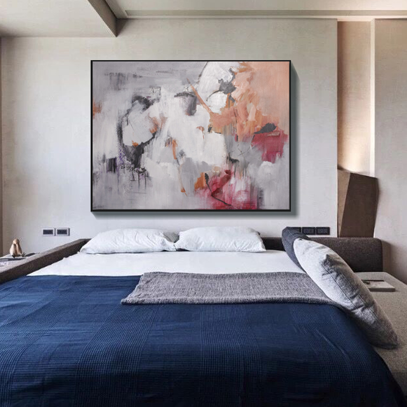
The most common commercial design failure is undersized art. A tiny canvas floating on a massive architectural wall looks amateurish. You must solve the scale problem decisively. As a strict rule, wall art should span 60% to 75% of the anchoring furniture's width. If you have a three-meter lobby sofa, your canvas must be substantially wide. We highly recommend A1-A0 sizes or XL custom canvases measuring 120-150cm across. Using large abstract wall art commands attention. It prevents expansive architectural walls from feeling uncomfortably empty.
Next, consider tactile engagement. Corporate environments often feel fundamentally sterile. They consist entirely of flat, hard surfaces like glass, polished steel, and painted drywall. You need to introduce warmth. A heavy textured canvas painting solves this architectural deficit beautifully. Impasto techniques or mixed-media layers add necessary physical depth to the room. The changing ambient daylight catches these ridges throughout the day. This creates a living, dynamic surface that flat prints simply cannot replicate.
Finally, apply shape counterpoint theory. You must intentionally match art shapes to your interior architecture to create balance. If a room features heavily curved, organic furniture, you should ground the space using rigid, geometric abstracts. If a room contains harsh, angular architectural lines, introduce fluidity. Use soft, sweeping abstract curves to soften the room's hard edges.
Best Practice: Always measure the vertical volume of your space. High ceilings require vertically oriented canvases to draw the eye upward naturally. Never place a horizontal panorama on a narrow, double-height atrium wall.
Procurement requires balancing budget constraints with maximum aesthetic impact. Sometimes, high-quality off-the-shelf pieces work perfectly for secondary corridors. Other times, specific high-visibility projects demand a bespoke approach.
You should specify custom commissions for flagship headquarters or boutique environments. A premium hotel abstract painting project often requires precise spatial storytelling. Commissioning art allows you to weave local community context directly into the canvas. You might incorporate subtle tonal nods to the company's geographic history. More importantly, specifying a custom abstract painting guarantees an exact fit for unusual spatial dimensions. You never have to compromise on scale or proportions.
For standard workspaces, consider a different engagement tactic. Standard office wall decor often feels disconnected from the staff working nearby. We suggest introducing employee participatory selection. This serves as an excellent risk-mitigation strategy. Curate a shortlist of three or four approved abstract pieces. Then, let the departments vote on their favorite option for their specific zone. Allowing teams to choose their localized artwork dramatically increases workplace ownership. It boosts morale and overall employee satisfaction with the physical office.
When sourcing commercial art at scale, vendor reliability becomes critical. Evaluate your partners using strict operational criteria:
Professional implementation separates successful projects from chaotic, last-minute installations. You must challenge the traditional construction timeline. Typically, designers treat artwork as a final decorative afterthought. We strongly advocate for a "Start with the Art" approach. Specify your high-value anchor pieces early in the architectural planning phase. This allows general contractors to design directional lighting specifically around the canvas. It also ensures builders install proper in-wall blocking (plywood backing) to support heavy XL frames safely.
Once on site, hanging logistics require absolute precision. We follow objective museum standards. You must center artworks exactly at eye level. For standing areas like hallways or reception foyers, place the horizontal center of the canvas 145 to 150cm from the floor. Adjust this slightly lower for seated areas like dining lounges or conference rooms. Consistency across the entire facility is crucial for a polished look.
Finally, you must give the art adequate "breathing room." Commercial walls easily look cluttered if overfilled with visual data. Outline strict negative space requirements. An artwork needs empty wall space around it to project authority. If you must fill a very long corporate corridor, avoid eclectic gallery walls. Instead, rely on grid-groupings. Structured diptychs or triptychs maintain visual order. They guide visitors down the hall rhythmically without overwhelming their senses.
Specifying abstract art serves as an essential exercise in architectural completion. It finalizes the spatial narrative rather than simply filling blank wall space with generic color. When treated as a strategic asset, abstract paintings transform sterile commercial zones into engaging, productive environments.
To move forward effectively with your upcoming commercial interior projects, consider these immediate action steps:
A: The canvas should span 60% to 75% of the furniture's width to maintain proportional balance. This ratio prevents the artwork from looking timid or visually overwhelming the anchor furniture piece below it. It ensures the space feels intentionally designed.
A: Abstract visuals significantly lower cognitive load and reduce daily stress. Unlike blank walls that cause visual fatigue, or aggressive signage that demands active reading, abstraction provides a mental resting place. This restorative effect helps sustain baseline productivity throughout the workday.
A: Yes, but we advise a complementary approach rather than a rigid exact match. Using exact brand colors everywhere makes the space look like a uniform corporate brochure. Instead, integrate subtle accent tones that echo your brand identity gracefully.
A: For commercial settings, fewer, larger pieces generally perform better. Large singular canvases or structured triptychs project higher corporate authority. They also create less visual clutter and are considerably easier for facility management teams to maintain than eclectic gallery walls.